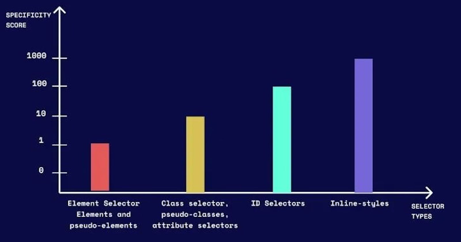
When arranging selectors in a stylesheet, it's a good practice to follow a logical and organized structure. While it might not be strictly necessary to write your CSS stylesheets in increasing order of specificity, it's a common convention that can contribute to the readability and maintainability of your code. Following a logical structure in your stylesheet makes it easier for you and others to understand the styling hierarchy.
However, the most critical factor is to ensure that your styles are clear, organized, and easy to maintain. If you have a system that works well for you and your team, and you can quickly understand and update the styles, that's the most important aspect.
In practice, it often makes sense to group your styles by type (element, class, ID) and then arrange them in an order that makes sense based on your project's specific needs. This might mean placing more generic styles first and getting more specific as you progress through the stylesheet.
Remember that CSS is a flexible language, and there can be variations in coding styles. The key is consistency within your project and ensuring that your code is manageable and maintainable over time.
Here's a suggested order:
Reset or Normalize Styles: If you are employing a CSS reset or normalize stylesheet, place it at the beginning to establish a consistent baseline across browsers and eliminate potential inconsistencies between different browser renderings.
Element Selectors: Start with styling for basic element selectors (e.g.,
body,p,a).Class Selectors: Next, apply styles for class selectors.
ID Selectors: Place styles for ID selectors after classes. ID selectors have higher specificity, so they should come later.
Nested Selectors: If you have nested elements or specific structure-based styles, include those next.
Pseudo-classes and Pseudo-elements: Styles for pseudo-classes (
:hover,:active, etc.) and pseudo-elements (::before,::after) can be added here.Media Queries: If you're using responsive design, organize media queries based on the breakpoints they target.
/*1. Reset or normalize styles */
@import url('reset.css');

/*2. Base styles for elements */
body {
  font-family: 'Arial', sans-serif;
}

/*3. Styles for classes */
.button {
  background-color: #3498db;
  color: #fff;
}

/*4. Styles for IDs */
#header {
  font-size: 24px;
}

/*5. Nested selectors */
nav ul {
  list-style-type: none;
}

/*6. Pseudo-classes and pseudo-elements */
a:hover {
  text-decoration: underline;
}

/*7. Media queries for responsive design */
@media (max-width: 768px) {
  /* Styles for smaller screens */
}
In conclusion, organizing selectors logically and prioritizing clarity over strict specificity enhances the readability and maintainability of CSS code. While the practice of ordering styles in increasing specificity is common, the paramount focus should be on clear, organized, and easily maintainable styles. Flexibility within CSS allows variations in coding styles, but maintaining consistency ensures manageability over time. The suggested order—starting with resetting styles, followed by elements, classes, IDs, nested selectors, pseudo-classes, pseudo-elements, and media queries—provides a structured, adaptable approach for cohesive and responsive design.
